This page gives you a clear breakdown of every AQI color zone, what each range means for your health, and how using an air quality index map Los Angeles can help you make more confident decisions to protect the air inside your home. If you live in a high-wildfire-risk area, manage a household with asthma or allergy sufferers, or simply want cleaner indoor air, reading this map correctly is a smart place to start.
TL;DR Quick Answers
air quality index map los angelesair quality index map los angeles
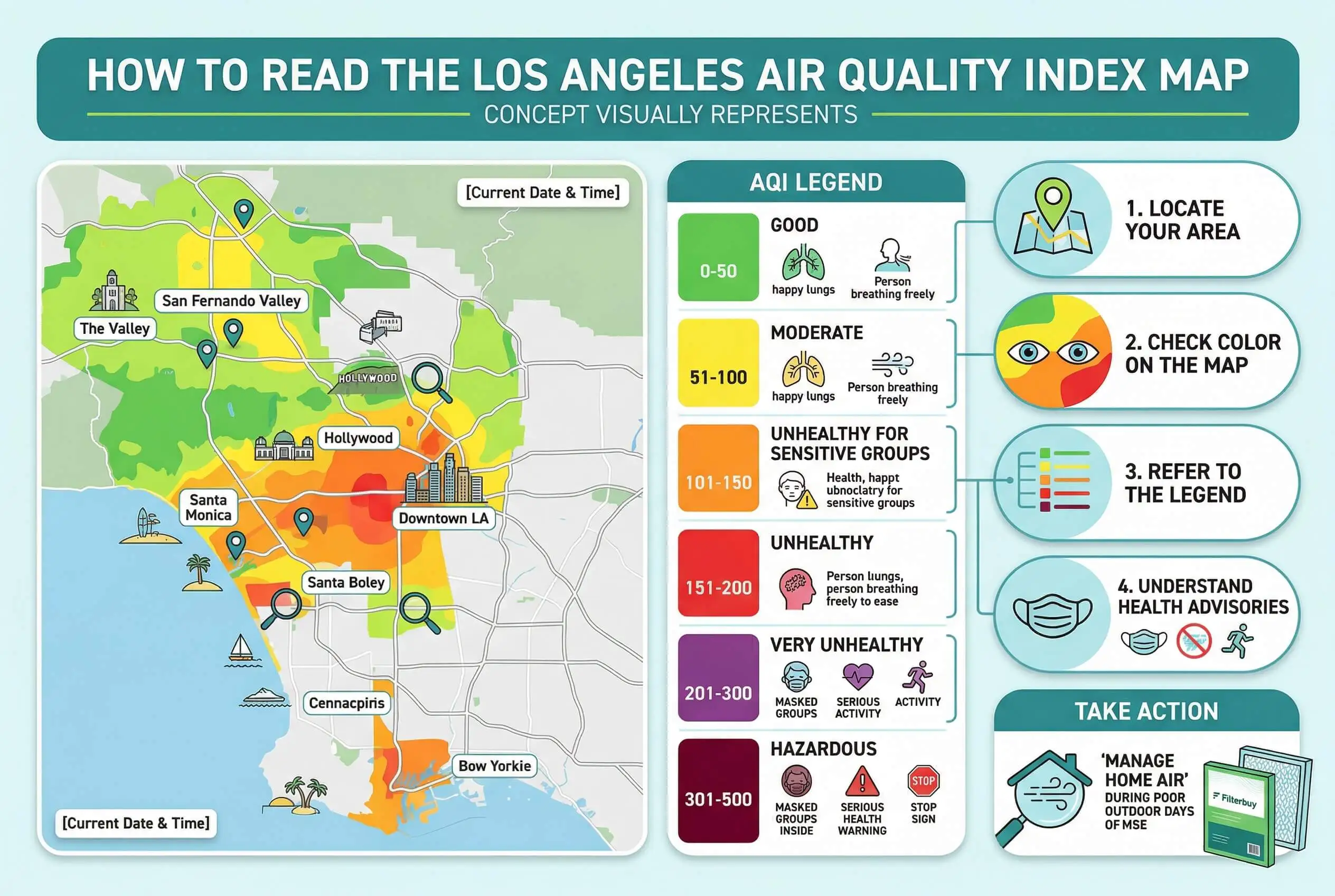
The Los Angeles Air Quality Index map is a real-time, color-coded tool that measures outdoor air pollution levels across the basin. It is operated by the South Coast Air Quality Management District and powered by more than 1,200 ground-level sensors tracking ozone, PM2.5, and other key pollutants. Here is what every Los Angeles household needs to know:
The AQI scale runs from 0 to 500 across six color zones — Green (Good) to Maroon (Hazardous)
Each color zone corresponds to a specific health threshold and a recommended protective action
Los Angeles has ranked as the most ozone-polluted city in the nation for 25 of the last 26 years
Wildfire smoke can push AQI readings from Green to Red or Purple overnight
Sensitive groups — children, elderly adults, and anyone with asthma or heart disease — should begin protective action at Orange, not Red
Closing windows alone is not enough during Red, Purple, or Maroon events — a MERV 11 or MERV 13 HVAC filter is your most effective indoor barrier
Check the South Coast AQMD interactive map daily at https://www.aqmd.gov/home/air-quality/current-air-quality-data for neighborhood-level readings across the entire Los Angeles Basin.
Top Takeaways
The AQI map is a health tool, not a weather tool. Check it every morning before outdoor plans are made.
Six color zones, six levels of action — from Green (safe) to Maroon (hazardous). Each requires a different household response.
If your household includes children, elderly family members, or anyone with asthma or heart disease, treat Orange as your personal Red.
Three conditions drive the worst AQI spikes in Los Angeles: wildfire smoke, Santa Ana wind events, and summer ozone season.
Closing windows is not enough during Red, Purple, or Maroon events. Your HVAC filter is your last line of defense against infiltrating pollutants.
AQI conditions vary significantly across the basin. Always check neighborhood-level data — not city-wide averages.
Upgrade to a MERV 11 or MERV 13 filter before wildfire season. In our experience, wildfire events can cut a standard filter's effective life in half.
The map shows what is happening outside. Your filter determines what your family actually breathes inside.
What Is the Los Angeles Air Quality Index?
The Air Quality Index — or AQI — is a standardized scale developed by the U.S. Environmental Protection Agency to measure how polluted the outdoor air is on any given day. In Los Angeles, the South Coast Air Quality Management District monitors AQI levels in real time using a network of ground-level sensors positioned across the basin, from the coast to the inland valleys. The map translates that raw data into a color-coded display that any resident can read at a glance.
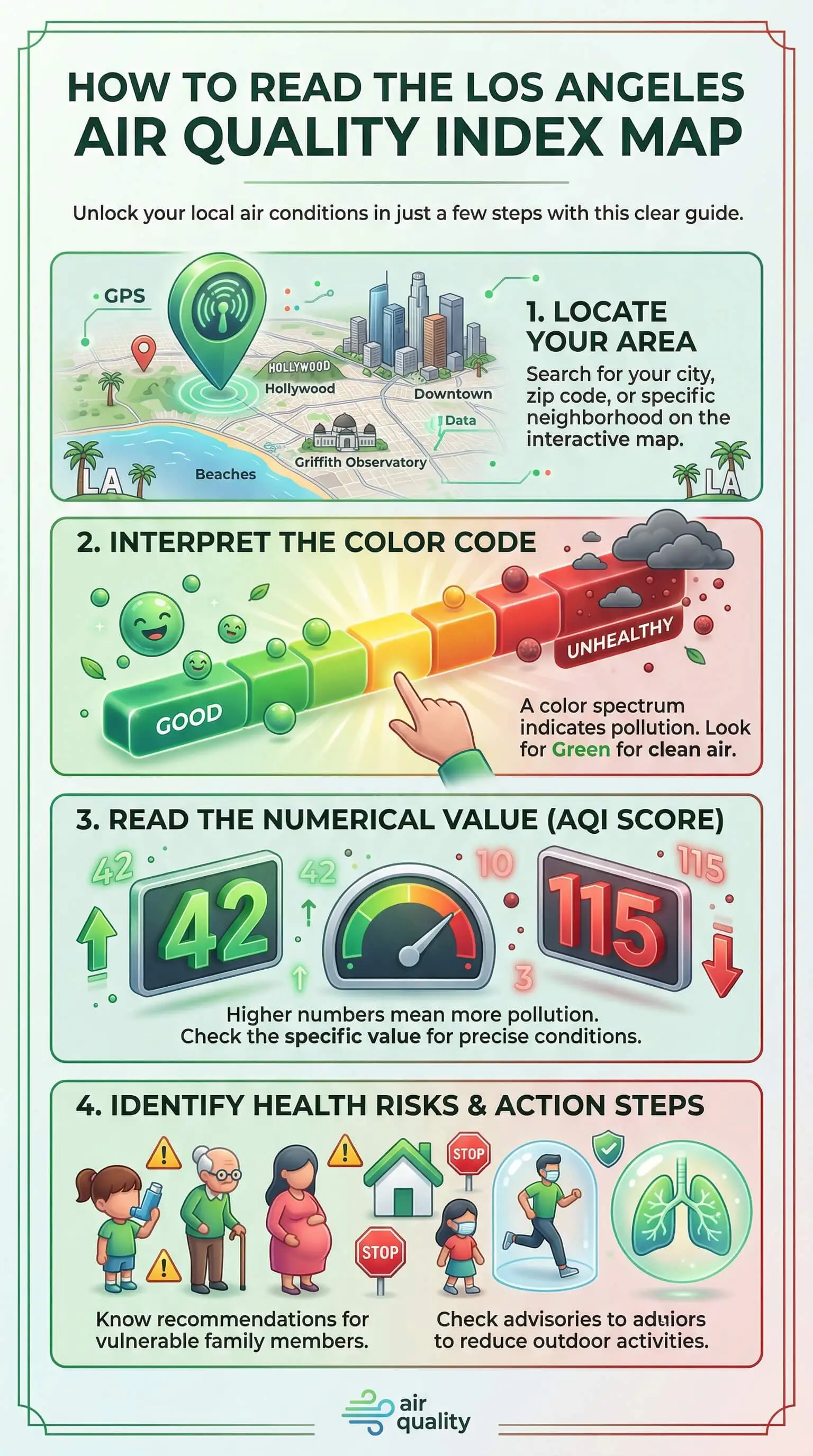
The AQI scale runs from 0 to 500. The higher the number, the more polluted the air — and the greater the health risk for people breathing it.
The Six AQI Color Zones Explained
Each color on the Los Angeles AQI map corresponds to a specific numerical range and a recommended health response. Here is what each zone means:
Green (0–50) — Good: Air quality is satisfactory. No health precautions are needed for most people.
Yellow (51–100) — Moderate: Acceptable air quality, but unusually sensitive individuals may notice mild effects.
Orange (101–150) — Unhealthy for Sensitive Groups: Children, the elderly, and anyone with asthma, heart disease, or respiratory conditions should limit prolonged outdoor exertion.
Red (151–200) — Unhealthy: Everyone may begin to experience health effects. Sensitive groups face serious risk. Limit time outdoors and reduce strenuous activity.
Purple (201–300) — Very Unhealthy: Health warnings go into effect for the entire population. Outdoor activity should be avoided, especially for vulnerable groups.
Maroon (301–500) — Hazardous: Emergency conditions. Everyone is at risk of serious health effects. Remain indoors and keep windows and doors closed.
What Drives AQI Spikes in Los Angeles
Los Angeles faces a unique combination of air quality challenges that most cities don't. After tracking air quality trends across millions of filter customers nationwide, we've found that Los Angeles residents tend to see the most dramatic AQI swings during three recurring conditions:
Wildfire smoke drifting in from the San Gabriel Mountains, Angeles National Forest, and outlying counties can push AQI readings from Green to Red overnight.
Santa Ana wind events trap and concentrate pollutants in the basin, compounding ground-level ozone levels.
Summer ozone season typically runs from May through October, when heat and traffic emissions combine to produce the region's highest ground-level ozone readings.
Understanding what's driving a spike helps you respond correctly — wildfire smoke and ozone require different protective measures at home.
Who Faces the Greatest Risk
No two households are the same, and the AQI doesn't affect everyone equally. The groups most vulnerable to elevated air quality readings include:
Children under 18, whose lungs are still developing
Adults over 65, who are more susceptible to cardiovascular and respiratory strain
Anyone diagnosed with asthma, COPD, heart disease, or diabetes
Pregnant women, due to the elevated risk to fetal development
Outdoor workers with prolonged exposure during high-AQI hours
If your household includes anyone in these groups, we recommend treating the air quality index for pets as part of your personal action threshold at Orange — not Red.
How to Use the Map to Protect Your Household
Reading the color is only the first step. Acting on it is what protects your family. Here is how to apply the AQI map to your daily routine:
Check the map before 8 a.m. Morning readings reflect overnight accumulation and give you the clearest picture for the day ahead.
Note which part of the basin is affected. AQI conditions in Santa Monica can differ significantly from readings in Pomona or the San Fernando Valley on the same day.
Adjust outdoor plans based on your household's risk profile. A Yellow day may be fine for a healthy adult but an Orange day for a child with asthma.
Keep windows closed during Red, Purple, or Maroon conditions. Outside air actively degrades indoor air quality during these events.
Change your HVAC filter more frequently during extended high-AQI periods. In our experience manufacturing filters for over a decade, wildfire events and sustained ozone seasons accelerate filter loading — sometimes cutting a 90-day filter's effective life in half.
How Outdoor AQI Affects Your Indoor Air
One detail the map doesn't show you is what's happening to the air inside your home. When outdoor AQI climbs, pollutants don't wait at your door — they infiltrate through gaps in windows, doors, and HVAC systems. We've seen this pattern consistently across the households we serve: a sustained Red or Purple air quality event outside almost always means degraded indoor air quality for families who don't take active steps to counteract it.
A properly rated HVAC filter is your first line of defense. During elevated AQI periods in Los Angeles, a MERV 11 or MERV 13 filter provides significantly better protection against fine particulate matter — including wildfire smoke particles — than a standard MERV 8.
"Most Los Angeles residents check the AQI map the same way they check the weather — they see the color, decide whether to grab a jacket, and move on. But the color alone doesn't tell you the whole story. After manufacturing air filters for over a decade and serving households across some of the most air-quality-challenged regions in the country, we've learned that the real risk isn't always what's happening outside — it's what follows you back in. During a Red or Purple AQI event, the right filter can play an important role in supporting the best air quality indoors by helping reduce the fine particulate matter and wildfire smoke that can infiltrate through the HVAC system. The map tells you what the air outside is doing. Your filter determines what your family actually breathes."
Essential Resources
After manufacturing air filters for over a decade and serving more than two million households — many of them in some of the most air-quality-challenged regions in the country — we know that reading the AQI map is only half the equation. Acting on what it tells you is what actually protects your family. These seven resources give you everything you need to go from confused to confident.
1. South Coast AQMD Interactive Air Quality Map — The Most Precise Neighborhood-Level AQI Data in the LA Basin
Don't settle for a city-wide reading when your neighborhood may tell a completely different story. The South Coast AQMD's interactive map covers more than 1,000 locations across Los Angeles, Orange, San Bernardino, and Riverside counties — giving you the street-level detail you need to make informed decisions for your household. https://www.aqmd.gov/home/air-quality/current-air-quality-data
2. South Coast AQMD Air Quality Forecasts — Know What's Coming Before It Reaches Your Door
Reacting to bad air after it arrives is already too late, especially for households with children, elderly family members, or anyone managing asthma or respiratory conditions. The South Coast AQMD's daily and next-day forecasts, organized by subregion, give your family the advance notice needed to adjust outdoor plans, close windows early, and swap out a filter before conditions peak. https://www.aqmd.gov/home/air-quality/air-quality-forecasts
3. AirNow.gov AQI Basics — Decode Every Color on the Map With Confidence
Most people can name the AQI colors but can't tell you what makes Orange different from Red when it comes to protecting their family. The EPA's AQI Basics page closes that gap — breaking down all six color-coded categories, the pollutants each one tracks, and the health thresholds that determine when and how you need to act. https://www.airnow.gov/aqi/aqi-basics/
4. AirNow.gov Using the Air Quality Index — Translate AQI Numbers Into Real-World Household Decisions
Knowing the AQI is one thing. Knowing what to do about it is another. This EPA guide walks you through exactly how to apply current and forecasted AQI readings to daily decisions — including outdoor activity, exercise timing, and when the NowCast is telling you conditions are shifting in real time. https://www.airnow.gov/aqi/aqi-basics/using-air-quality-index/
5. AirNow.gov Fire and Smoke Map — Track Wildfire Smoke Before It Reaches the Los Angeles Basin
In our experience, the households most caught off guard by poor air quality in Los Angeles aren't the ones ignoring the map — they're the ones looking at the wrong data. The AirNow Fire and Smoke Map layers live wildfire smoke tracking directly over AQI readings, so you can see exactly when smoke from outlying counties is heading toward your zip code before it shows up on your doorstep. https://www.airnow.gov/wildfires/fire-and-smoke-map/
6. California Air Resources Board — State-Backed Guidance on Protecting Your Home During Elevated AQI Events
When outdoor air quality drops, your home is only as protected as the filter inside your HVAC system. CARB — California's lead air quality agency — recommends running your system with the fresh-air intake closed during wildfire smoke events and installing a high-efficiency filter with the highest MERV rating your system supports. This is exactly what we've been helping Los Angeles households do for over a decade. https://ww2.arb.ca.gov/
7. EPA Air Quality Index: A Guide to Air Quality and Your Health — The Complete Reference Every LA Household Should Have
If you want to understand not just what the AQI map shows, but why each threshold was set and what the science says about protecting every member of your household — this is the resource. The EPA's full consumer health guide covers all six pollutant categories, health thresholds by risk group, and the specific protective actions recommended at every level of the scale. https://www.airnow.gov/publications/air-quality-index/air-quality-index-a-guide-to-air-quality-and-your-health/
These essential resources help Los Angeles households read AQI maps, track smoke and forecasts, and take practical steps to improve air quality and protect their families during poor air conditions.
Supporting Statistics
Most Los Angeles families underestimate how serious the air quality situation actually is. After manufacturing air filters for over a decade and serving more than two million households, we've learned that the data behind the AQI map tells a story most residents never see. Here is what the research shows — and what it means for your household.
Statistic 1: Los Angeles Has Ranked as the Most Ozone-Polluted City in the Nation for 25 of the Last 26 Years
This is the statistic that stops most Los Angeles residents in their tracks. According to the American Lung Association's "State of the Air" 2025 report:
Los Angeles holds the top national ranking for worst ozone pollution in 25 of the 26 years the report has been published
Residents are exposed to approximately 77 fewer unhealthy ozone days per year than they were in 2000
Despite that progress, Los Angeles still ranks last in the country for ozone pollution
In our experience, improvement is not the same as safety. A city can trend in the right direction and still rank last in the nation. For households with children, elderly family members, or anyone managing a respiratory condition, Los Angeles's ozone problem is not a historical footnote. It is an active daily reality — one the AQI map makes visible every morning.
Source: American Lung Association — State of the Air 2025, Key Findings https://stateoftheair.org/key-findings
Statistic 2: 7.3% of Children Ages 0–17 in Los Angeles County Currently Have Asthma
One of the most consistent patterns we've observed across the households we serve is that families with young children tend to underreact to moderate AQI readings — when the real danger often falls in between the obvious extremes. The 2023 Los Angeles County Health Survey puts the stakes into focus:
7.3% of children ages 0 to 17 in Los Angeles County currently have asthma
Rates climb to 9.5% among Black and African American children and 8% among children of Latino ancestry
Children under five are nearly twice as likely to visit the emergency department with asthma symptoms as older children
That last data point reshapes how we advise households with young children about the AQI map. Orange is not a caution flag for your family. It is a stop sign.
Source: Los Angeles County Department of Public Health — Breathless: Impact of Asthma on Children in Los Angeles County (2025) http://publichealth.lacounty.gov/phcommon/public/media/mediapubhpdetail.cfm?prid=5151
Statistic 3: Wildfires Can Account for Up to 50% of PM2.5 Pollution in Some Western Regions
The AQI map shows you that air quality is poor. What it cannot show you is where the pollution is coming from. Research from the California Air Resources Board reveals:
Wildfires account for up to 25% of PM2.5 particulate matter across the United States
In some western regions during active fire events, that figure climbs to 50%
PM2.5 particles measure 2.5 micrometers or smaller — small enough to penetrate deep into the lungs and pass directly into the bloodstream
We've seen this pattern firsthand in filter demand data from our Los Angeles customers during wildfire season. Filter replacement rates spike sharply during extended Red and Purple AQI events — not because customers become more diligent, but because their filters are loading faster than normal. A home running a standard MERV 8 filter during a wildfire smoke event is not meaningfully protected. The map tells you smoke is coming. Your filter rating determines how much of it your family actually breathes.
Source: California Air Resources Board — Wildfire Emissions Estimates https://ww2.arb.ca.gov/wildfire-emissions
Statistic 4: Approximately 109 Million Americans Live in Counties With Pollution Levels That Exceed Federal Air Quality Standards
Most people assume federal air quality standards are being met in their area. According to the EPA's most recent national air quality summary:
Approximately 109 million Americans live in counties where pollution levels exceed the primary National Ambient Air Quality Standards
Roughly 64 million tons of pollution were emitted into the atmosphere nationwide in 2024 alone
Los Angeles County remains one of the most persistently affected regions in the country
The AQI map is the tool that translates this national-scale problem into something specific and actionable, helping you decide when an air purifier can make the biggest difference for your household, your neighborhood, and your family on any given day.
Source: U.S. Environmental Protection Agency — Air Quality National Summary https://www.epa.gov/air-trends/air-quality-national-summary
Final Thoughts
Reading the Los Angeles AQI map is not complicated. Acting on what it tells you — consistently, correctly, and before conditions deteriorate — is where most households fall short. After manufacturing air filters for over a decade and serving more than two million households, including thousands in the Los Angeles Basin, here is our honest take.
Most families treat the AQI map like a weather forecast — something to glance at and briefly factor into the day's plans. That approach works when you're deciding whether to bring an umbrella. It works poorly when you're making decisions that directly affect the air your children breathe and the long-term respiratory health of everyone in your household.
The AQI map is not a weather tool. It is a health tool. That distinction is the single most important mental shift Los Angeles residents can make.
Here is what the data alone doesn't fully capture:
The indoor air assumption is the most dangerous one. Closing windows during a Red or Purple AQI event is not enough. Pollutants infiltrate through HVAC systems, door gaps, and building envelope penetrations. A home without a properly rated filter is not a sealed environment.
Wildfire season has redefined what "normal" looks like in Los Angeles. A decade ago, Red AQI events were relatively rare and short-lived. Our filter demand data tells a different story today. Extended Purple and Hazardous events are no longer exceptional — they are a recurring seasonal reality that requires advance planning, not reactive responses.
Sensitive groups are being underserved by standard AQI guidance. Official guidance tells sensitive groups to limit outdoor activity at Orange. In our experience, households with young children, elderly family members, or asthma sufferers need to begin indoor air protection measures at Orange — not just reduce time outside. Closing fresh-air intakes and upgrading to a MERV 11 or MERV 13 filter should happen before Red arrives, not after.
Los Angeles has made genuine progress on air quality over the past three decades. But progress measured against the worst baseline in the country still leaves millions of families breathing air that fails federal health standards on a regular basis.
The AQI map makes that invisible problem visible. Using it well — understanding every color zone, knowing your household's risk profile, and connecting outdoor readings to indoor protective action — is one of the most practical things you can do to protect the people inside your home.
FAQ on Air Quality Index Map Los Angeles
Q: What is the Air Quality Index map for Los Angeles and how does it work?
A: The Los Angeles AQI map is a real-time, color-coded display of outdoor air pollution levels across the basin. Here is how it works:
Powered by more than 1,200 ground-level sensors operated by the South Coast AQMD
Tracks five key pollutants: ozone, PM2.5, PM10, nitrogen dioxide, and carbon monoxide
Translates raw sensor data into six color zones — Green (Good) to Maroon (Hazardous)
Updates in real time at the neighborhood level across Los Angeles, Orange, San Bernardino, and Riverside counties
After serving Los Angeles households for over a decade, we've found that most residents know the colors exist but have never been told what to do when the color changes. That is the gap this page is designed to close.
Q: How often does the Los Angeles AQI map update?
A: The South Coast AQMD map updates in real time. The two most important check-in times are:
Early morning: Overnight accumulation gives you the clearest picture for planning the day ahead
Early afternoon: When ozone levels in the basin typically peak
During active wildfire events or Santa Ana wind conditions, check more frequently. In our experience, Los Angeles AQI readings can shift from Green to Red in a matter of hours under the right weather conditions.
Q: What AQI level is unsafe for children and sensitive groups in Los Angeles?
A: The EPA sets Orange — AQI readings between 101 and 150 — as the official sensitive group threshold. Here is what that means in practice:
Orange is where indoor protective action should begin — not just outdoor activity reduction
Children under five are nearly twice as likely to require emergency care for asthma symptoms during poor air quality events
7.3% of Los Angeles County children currently have asthma — with rates of 9.5% among Black and African American children and 8% among children of Latino ancestry
In our experience, waiting for Red before acting is a risk no household with young children should take.
Q: How does wildfire smoke affect the Los Angeles AQI map readings?
A: Wildfire smoke is the most unpredictable and rapid driver of AQI spikes in the basin. Key facts:
Wildfires account for up to 50% of PM2.5 pollution in western regions during active fire events, according to the California Air Resources Board
AQI readings can surge from Green to Red or Purple overnight during wildfire smoke events
PM2.5 particles are small enough to penetrate deep into the lungs and pass directly into the bloodstream
We see this reflected in our own filter demand data. During wildfire events, Los Angeles customer filter replacement rates spike sharply — not from increased diligence, but because filters load at twice the normal rate. Use the AirNow Fire and Smoke Map to track incoming smoke before it registers on the standard AQI map.
Q: How do I use the Los Angeles AQI map to protect the air inside my home?
A: Check the South Coast AQMD neighborhood-level map each morning and act on your zone — not around it. Here is the framework we share with the households we serve:
Green or Yellow: Standard ventilation is appropriate for most households
Orange: Close HVAC fresh-air intakes. Limit outdoor exertion for children and sensitive group members
Red: Keep windows and doors closed. Run your HVAC system on recirculation with a properly rated filter installed
Purple or Maroon: Stay indoors. A MERV 11 or MERV 13 filter is your most effective barrier against fine particulate matter and wildfire smoke infiltration
The households best protected during Los Angeles AQI events share one thing in common — they act before conditions peak, not after.
Take Control of the Air Inside Your Los Angeles Home
Reading the Los Angeles Air Quality Index map tells you what is happening outside — but protecting your family starts with what is filtering the air inside. Shop Filterbuy's MERV 11 air filters today and make sure your home is ready before the next AQI spike hits.


